Layout and graphics
LAYOUT

Layout

Asymmetrical

Text
-the text should be :
- Legible
- Appropriate font face
- Left Justified
- Right Justified
- Centered
- Easy to read

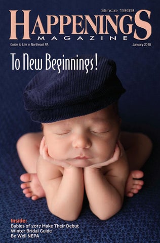
Image
-Images should be: proportionate, sharp in color, with high resolution, with appropriate captions.

Color and shape
- use color to create interest by providing variety in the design (color, contrast and shapes)


Layout
-It is a process of planning and arranging graphics or text in a page or book.
A good layout should have a balanced make up and alignment of elements.
Symmetrical
-There should be equal weights or elements on both sides of the page.
Asymmetrical
-It may be asymmetrical when there is an artistic and different intensity on one side of the page.
Text
-the text should be :
- Legible
- Appropriate font face
- Left Justified
- Right Justified
- Centered
- Easy to read
Image
-Images should be: proportionate, sharp in color, with high resolution, with appropriate captions.
Proximity and Harmony
-the elements should be close together and scattered and arranged apart from each other. Element should not be cluttered and not compete with each other.
-the elements should be close together and scattered and arranged apart from each other. Element should not be cluttered and not compete with each other.
Consistency
- there should be uniformity of theme on each page.

- there should be uniformity of theme on each page.
Color and shape
- use color to create interest by providing variety in the design (color, contrast and shapes)
Emphasis
- there should be one point of interest in a page. The elements to be emphasized should have a different size, color, shape or background.
- there should be one point of interest in a page. The elements to be emphasized should have a different size, color, shape or background.


Comments
Post a Comment